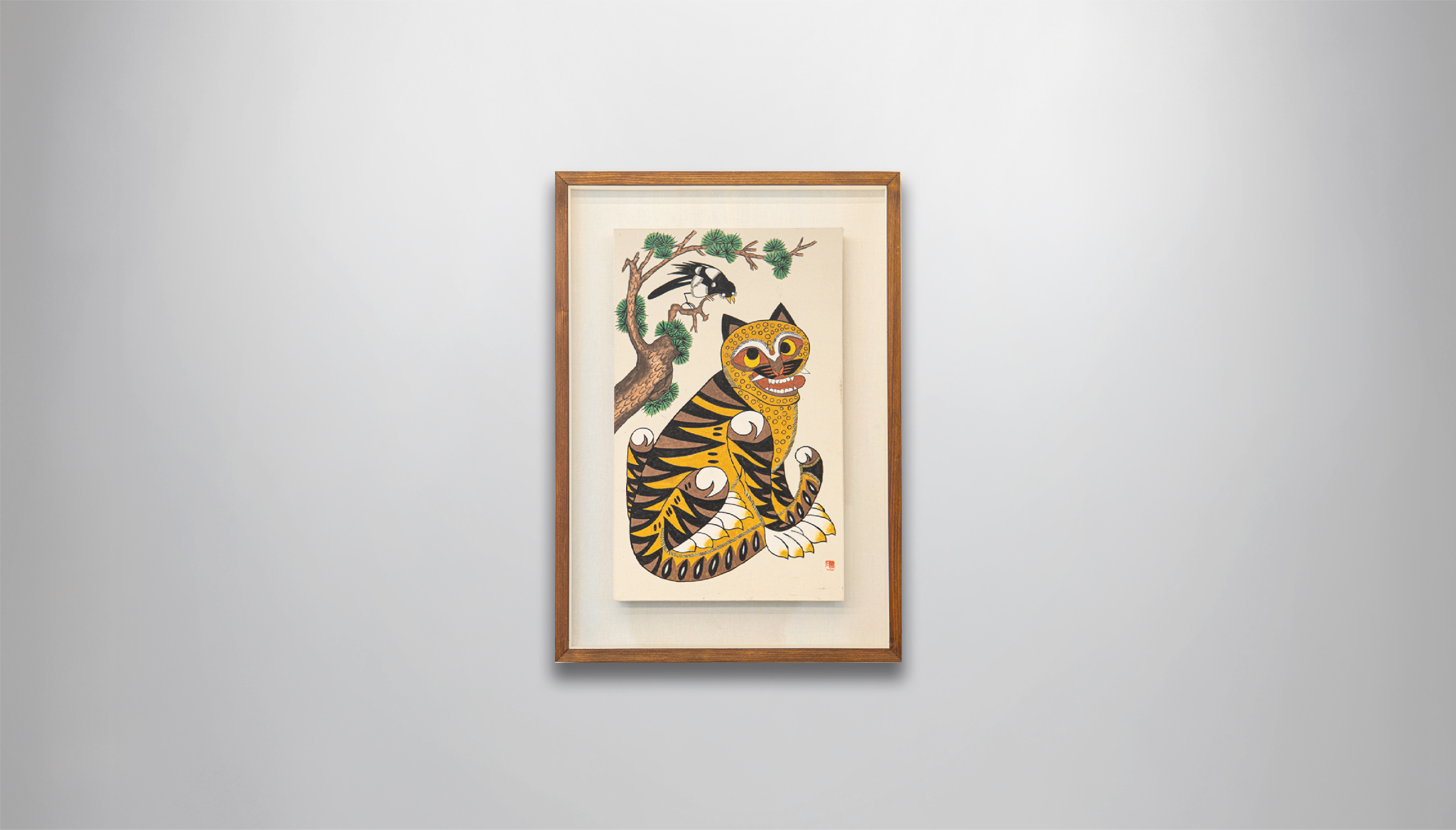
HOJAKDO
Magpie and Tiger
호작도
There are currently 3 orders ahead of you, and your order is expected to arrive in approximately 1.5 weeks.
Artwork dimensions exclude the frame. Items are shipped with the frame included.
Please note that dimensions may vary slightly due to the framing process.
Please allow approximately 2 to 3 weeks for delivery. Each piece is carefully packaged to ensure it arrives in perfect condition.
Hojakdo — Magpie and Tiger — Korean Heritage Painting
A painted talisman — hung in Korean homes for centuries as a hand-drawn guardian charm. Painted by both royal court artists and noble Korean households — five centuries of guardian heritage.
Magpie and tiger. The most widely hung painting in Korean household history, and for very good reason. A tiger — which should be terrifying — sits with the energy of someone who has forgotten what they were supposed to be doing. A magpie leans down from the pine branch above and chatters at it with complete confidence. For centuries, ordinary Korean people hung this image in their homes as a way of laughing at the things that frightened them, of making the fearsome feel manageable. Centuries later, it still makes people smile before they have had a chance to think about why.
But this tiger has something the traditional version does not. The usual amber-and-ochre palette has been pushed into something richer and more deliberate — a deep, saturated golden yellow that floods the entire body and turns the familiar stripes into something closer to molten. The choice is deliberate. In Eastern tradition, gold is the color of wealth, authority, and powerful yang energy. The traditional hojakdo guards your space. This one guards it and fills it with the auspicious aura of prosperity at the same time. Same subject, same structure, same irreverent grin — and an entirely different level of presence.
The tiger has always been the supreme protective spirit in classical Korean painting — a talisman against malevolent forces. Where it hangs, bad energy is drawn out, the spirit of the space is guarded, and the people within are sheltered. A golden tiger adds another layer entirely: the yang aura of wealth, the auspicious energy of prosperity, settling over the room. The magpie beside it is the auspicious herald — in classical Korean tradition, hearing a magpie call in the morning meant something fortunate was on its way that day. This one appears to be mid-announcement. Whatever it is telling the tiger, it is telling you too, every morning you walk past it.
At an entrance it stands guard. In a living room it anchors the energy of the space. In an office or executive room it communicates something about the person who chose it — that they have taste, that they have humor, and that they are not to be underestimated. Bold enough to command attention. Witty enough to never feel heavy.
The full warmth of a centuries-old tradition, with the volume turned up in gold. Hojakdo is the world's most cheerful guardian — the painting that protects your space, invites good fortune, and makes everyone who sees it want to know more about where it came from. To own this golden tiger is to bring laughter, protection, and prosperity into your space, all at once, in a single unforgettable image.
DISPLAY EXAMPLES

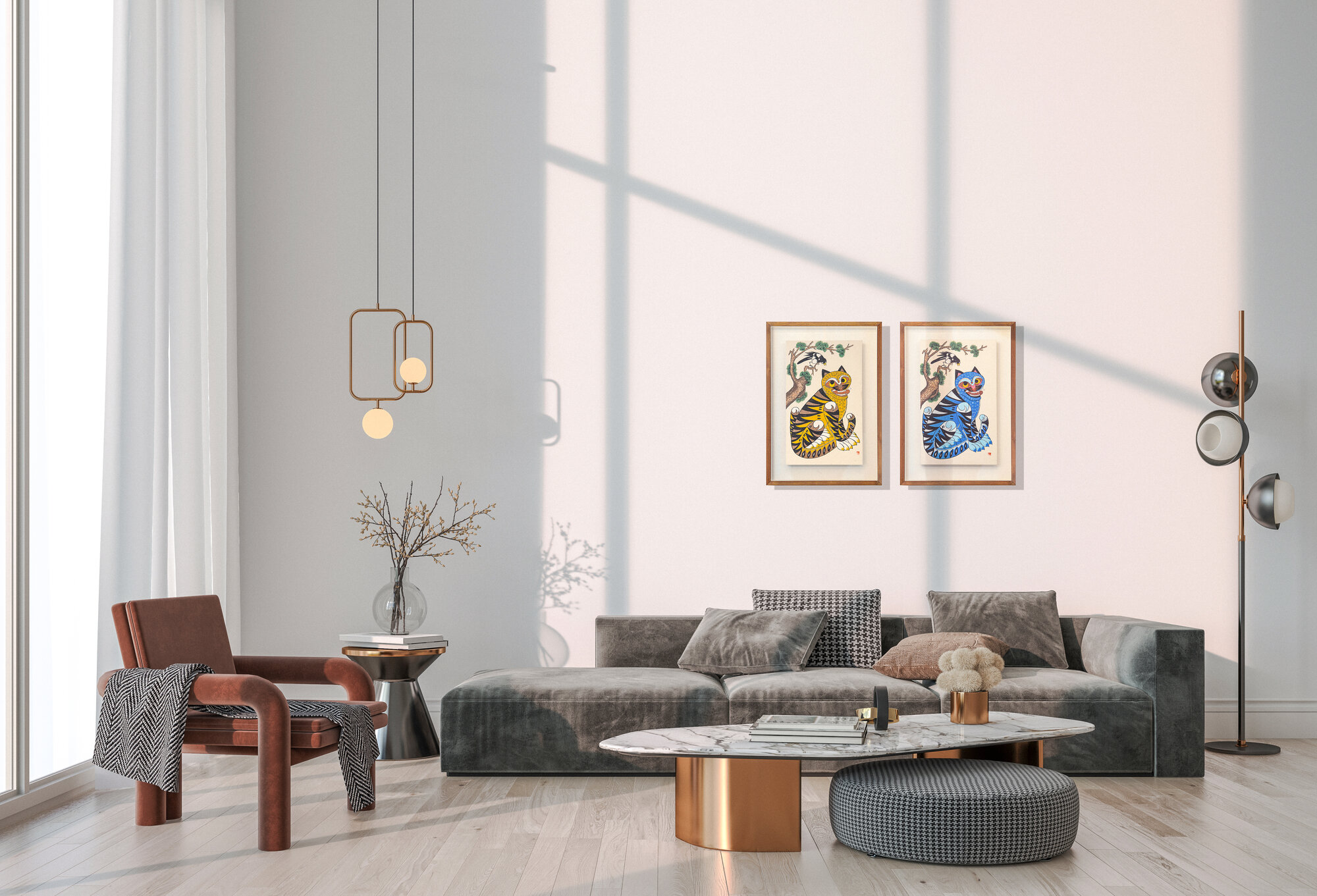
This artwork adapts beautifully to various spaces—from modern offices to traditional homes,
bringing sophistication and Korean cultural heritage to any environment.
INQUIRY BOARD
Leave a private inquiry about this artwork or any other piece. Recent inquiries from collectors are listed below.